Small Spaces, Elevated with Craft and Color
Choosing Materials that Work Hard in Compact Rooms
01
Stone, Composite, and Clever Alternatives
Marble whispers luxury, yet quartzite and porcelain slabs provide resilience with convincing veining and fewer maintenance worries. In compact kitchens, a honed finish reduces glare while preserving movement. Slim profiles feel lighter, especially when slab backsplashes continue seamlessly upward. Sample multiple edge treatments, test against your lighting, and photograph morning and evening conditions. The right slab reads elegant, not heavy, preserving airiness without sacrificing presence.
02
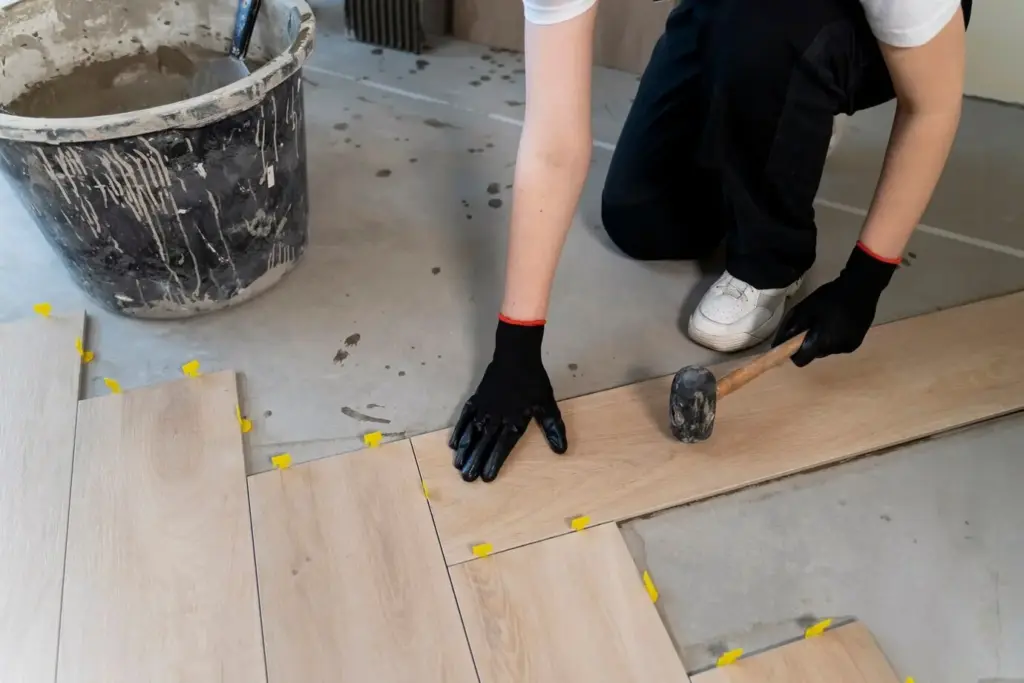
Wood Finishes that Age Gracefully
Lightly smoked or oiled oak introduces warmth without closing in the walls. Satin sheens highlight grain while avoiding the mirror-like reflectivity that shrinks perception. In cabinetry, vertical grain draws the eye upward, adding quiet height. For floors, narrower planks create rhythm without visual busyness. Keep stains balanced against wall color undertones so movement feels cohesive. Gentle patina over time adds narrative instead of clutter.
03
Metals and Hardware that Add Quiet Shine
Unlacquered brass, brushed nickel, and aged bronze deliver subtle light play rather than flash. Aim for consistency across touchpoints—handles, hooks, and lamp bases—to prevent noisy sparkle. Thin profiles, knurled textures, and warm metallic temperatures pair beautifully with natural textiles. Layer one dominant metal and a secondary accent for depth. As patina develops, the space gains intimacy and authenticity while remaining simplified and visually calm.
Color Strategies that Expand Perception
Light, Reflection, and Texture
Reflective Surfaces Used Responsibly
Strategic reflection enlarges perception, yet too much sheen crowds the senses. Place mirrors opposite windows to capture depth, not across from busy shelving. Choose glazed tile only where it amplifies natural light elegantly. Metals with brushed finishes scatter sparkle into softer halos. Balance each glossy moment with matte neighbors, ensuring breathing room. When reflection supports composition, rooms feel bright and composed instead of frenetic and over-stimulating.
Textiles that Breathe and Buffer Sound
Linen drapery filters daylight while maintaining privacy, especially in neutral tones that echo wall hues. Wool rugs ground the floor with resilience and acoustic comfort. Bouclé upholstery brings tactile richness without heavy patterns. Keep prints restrained and scale considered, complementing proportions rather than competing. Textiles are the quiet heroes of intimacy, smoothing echo, softening edges, and allowing premium materials to speak clearly against a calm, cohesive background.
Tile Scales, Grout Lines, and Visual Rhythm
In small baths or kitchens, tile choice can make or break spaciousness. Larger formats reduce grout interruptions, but balanced proportions matter—oversized pieces may dwarf compact fixtures. Consider elongated rectangles stacked vertically to heighten perception. Match grout closely to tile color for seamless continuity. Where pattern is desired, confine it to a single plane, maintaining clarity elsewhere. The rhythm of joints should guide movement, not dominate attention.
Storage and Built-Ins as Design Statements
Real-World Mini Case Studies
Studio Corner Transformed by Limewash and Linen
A cramped studio nook felt busy despite sparse furniture. We limewashed the walls in a softened mushroom tone, added ceiling-height linen panels, and introduced a petite oak desk with brass knobs. The monochrome envelope absorbed visual clutter while textiles softened echo. One deep blue chair anchored the gaze. Results: clearer workspace, better light diffusion, and a sense of embrace that encouraged focused morning routines and relaxing evening reading.
A Narrow Hallway Brightened with Mid-Tone Trim
The passage looked tunnel-like due to stark white contrast lines. We shifted walls to a warm off-white, painted doors and trim a related mid-tone taupe, and installed a low-sheen runner. A single framed print echoed the taupe’s undertone. The edges dissolved, the ceiling felt calmer, and the hallway seemed wider. Maintenance improved too, as mid-tones disguised scuffs. Family traffic flowed more comfortably, reducing daily friction immeasurably.
Compact Bath Elevated by Microcement and Brass
Tiled grids chopped the tiny bath into boxes. We replaced them with continuous microcement in a pale stone shade, added a modest brass shelf and tap set, and hung an arched mirror opposite the door. With minimal grout lines, surfaces read expansive. Warm metal punctuated softly, while a linen shower curtain introduced texture. The experience shifted from utilitarian to spa-like serenity, easier to clean and visually generous.
Where to Invest, Where to Edit
Sample Boards and On-Site Testing
Maintenance Routines that Protect Beauty
Practical Planning, Budgets, and Sourcing

All Rights Reserved.